
Are you looking to increase your website’s conversion rate (CRO) but don’t know where to begin? Wonder no more because that’s what I’m going to cover today.
While conversion rate optimization can seem complicated, all it means is creating more opportunities to increase your conversion rate. In this article, I detail twenty tips explaining how to improve your conversion rate optimization process.
I also provide a solid example and answer the most frequent questions about conversion rate optimization.
However, before I get into that, let’s begin with the basics.
What Is Conversion Rate Optimization?
There are many definitions available, but let’s keep it simple:
CRO is a digital marketing strategy aimed at increasing the amount of visitors who take a specific action on your website. It could be something as simple as clicking on a video or signing up to a mailing list. Alternatively, it could be a sale or subscription order.
However, to fully understand it, we need to back up a bit and look at what a conversion rate, and therefore, a conversion, even is.
Conversion rate is as old as business itself. Just the language is new.
Imagine a marketplace in ancient Rome.

(Image source: Forum Ancient Coins)
Let’s say you’re trading precious diamonds that you’ve managed to get a hold of from the far corners of the ancient empire.
Mercury, the god of trade, wants good things for you, and you convince 30 of your visitors to buy a diamond. The day before, you only managed to sell 15 of the valuable jewels, even though the same number of people, 100, visited your stall.
However, that means that from one day to the next, you doubled your conversion rate.
Whether in ancient Rome or on a modern e-commerce website, the conversion rate just describes the share of visitors to your store (or now your website) who actually buy from you. Simply put, It’s just another word for making a sale. Whenever someone actually ends up buying from you, that is counted as a conversion.
In online marketing, a conversion is when your visitor takes the action that you most want them to take.
That means that your conversion rate comes down to this equation below.
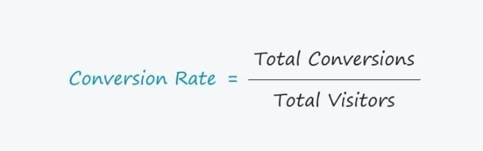
Ultimately, when it comes to your business, you define what a conversion is. For you, it might mean a sale. However, it could also mean clickthroughs, views, subscriptions, or downloading an eBook/whitepaper.
Alternatively, if you’re running a small consulting business, maybe you just want people to pick up the phone and call you. It’s all part of conversion rate optimization.
If you’re running a restaurant, maybe you’ll count dinner reservations.
Okay, okay, you get it, but why does conversion rate optimization matter?
Conversion Rate Optimization Example
Let’s walk through an example to see why conversion rate optimization is essential.
Naturally, optimizing the website of Walmart Canada for conversions wasn’t easy. Most conversion optimizers would tremble at the sheer size of the project.
Some years ago, Walmart.ca noticed that a large chunk of the traffic to its e-commerce website came from mobile devices, like tablets and smartphones.
Unfortunately, the page wasn’t optimized for mobile at all, resulting in 2 major problems.
The design was terrible, and the loading times were gigantic. These are 2 proven revenue killers because online, it has to be beautiful and fast.
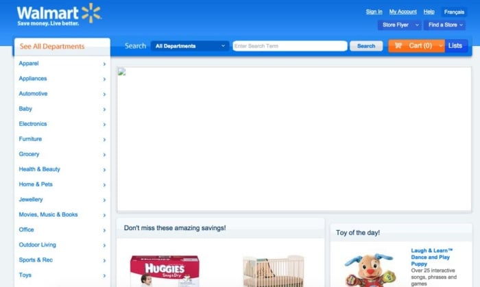
I’m guessing the image in the middle worked, but still, pretty bad.
According to SimilarWeb, the website gets 511.5 million hits per month.
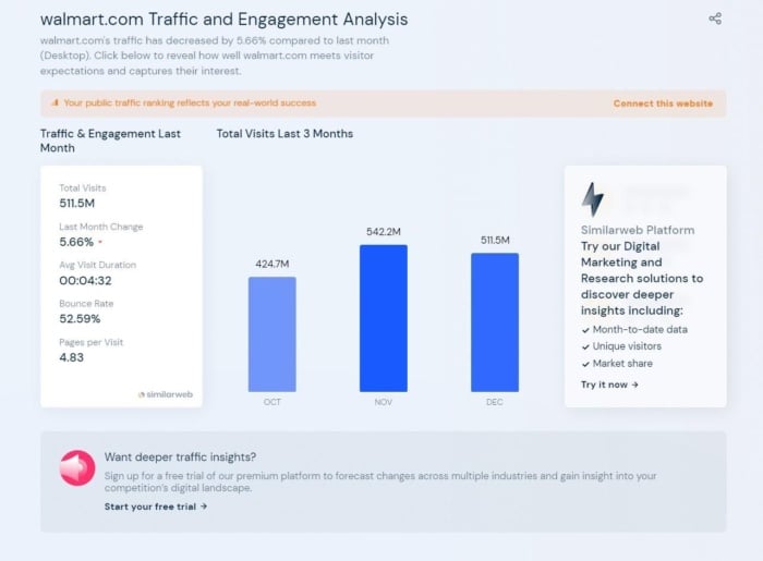
That’s probably more of an estimate, but let’s just run with it. Assuming 5% of people end up buying something (not unlikely, considering people spend over 4 minutes on the site, on average, browsing almost 5 pages), that means 25,575,000 people buy from their online store each month.
What options do you have, if you want to increase revenue from the online shop? Herein lies the magic of the conversion rate: you just optimize what’s already there and thus create more profit from your existing customers and traffic.
This is exactly what Walmart did and how it doubled the sales made on mobile devices. Looking at all online channels shows an increase in conversions of 20%.
Continuing with our example, a simple step up in design and improving loading times would lead to 30,690,000 people buying instead of 25,575,000.
Say the average purchase is $20.
What would that mean?
If 5,115,000 additional people spend $20 on Walmart.ca each month, that leads to a revenue increase of $102.3 million.
How’s that for making a quick million dollars on low-hanging fruit?
Would you spend $100,000 on a conversion agency, if they made you $102 million with improved e-commerce conversions? Yep.
With that in mind, Walmart focused on user experience first.
This is what the redesign looked like:
The page also adapts to mobile.
Not only did Walmart boost loading times by about 35%, they also hooked the site up on a fully scalable grid, to make navigation easier.
Walmart improved its design, ensuring it holds up to modern user experience criteria.
Furthermore, the website is now responsive and exactly fits itself to custom browser and screen sizes for different kinds of tablets and smartphones.
It didn’t stop there, though.
Walmart also used A/B split testing to determine what really works and what doesn’t.
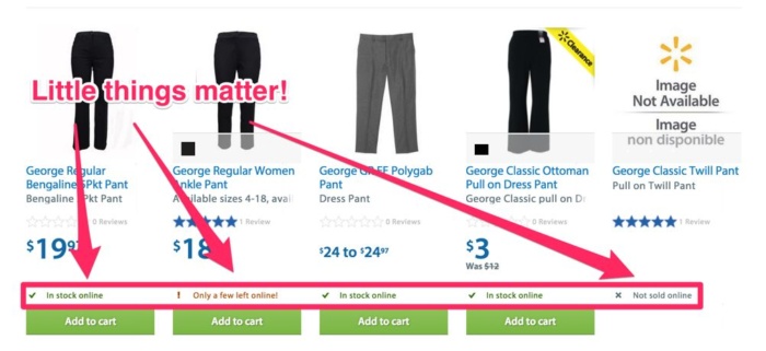
Collected data showed that removing the “Add to cart” or “View item” button, for things that weren’t available to order anyway, drastically improved conversions.
Furthermore, they now instantly show you whether the item is in stock, about to be sold out (which is a great urgency play), or not even sold online.
This helps shoppers decide what to add to their cart more selectively and thus, boosts conversions.
Your conversion rate is the easiest way to increase profits for your business, and that’s why it’s so important to optimize it.
Conversion Rate Optimization Tips
Now you’re clear on the definition, and you’ve seen a clear example of conversion rate optimization, it’s time to start talking you through 20 tips to increase your CRO.
Tip 1: Start A/B Testing
What is A/B testing? Think of it as conducting a scientific research study.
You split your traffic into two groups.
Group A gets to see a different version of your website than group B.
(Image source: Quick Sprout)
You can test different factors, like headlines, colors, buttons, website design, calls-to-action, font size, and more.
A/B testing is even used during presidential elections.
During the 2008 election, Obama’s team split-tested the website of the campaign.
They tried 24 different versions. Once they found a site conversion winner, it helped collect 2.8 million more email addresses.

(The winner – via Quick Sprout)
The key with A/B tests is to change only one thing from variation to variation. This is a cornerstone of conversion rate optimization.
For example, if you change the placement of the button, the image, and the copy from version A to B, and B actually performs better, how can you know what it was that improved your conversion rate?
Was it the button being on the right instead of the left? Or the new image?
You can only derive meaningful results from A/B testing if you can attribute the changes in conversion rate to a specific change that you made.
Note: Tests are often tied to users with cookies, so you don’t see a different version of the page every time you visit. Try checking back once a week or once a month, since pages are usually only switched around after a certain period of time.
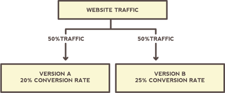
Say the goal of the blog is to generate email signups, and it drives 1000 visitors to each version of the page.
With the sidebar, 10% of people sign up. Without it, 20% of people sign up, then they know no sidebar works best.
However, it is important to collect enough data. Otherwise, your results won’t be statistically significant.
Once you get results, instead of completely giving up the version that doesn’t work as well, try increasing the share of traffic to the better-converting option instead.
Split your traffic 75%/25% and see if the conversion rate holds up.
Then, you can let go of one version altogether.
Note: I also recommend doing A/A tests first. This is a type of CRO experiment that pits two versions of the same page against each other to measure their performance to test your software and see if it reports false data.
There are a ton of things that you can A/B test, but here are some good starting points:
- Headlines
- Colors of design elements (like buttons)
- Placement of buttons (left vs. right vs. center)
- Page layout (sidebar vs. no sidebar)
- Copy (how do you describe your product?)
- Calls-to-action (buy now vs. try now)
- Media (images vs. videos vs. text)
These are also fairly easy to test and don’t take a lot of time. To start testing, you can use software, like Optimizely, but make sure that you have enough traffic to get meaningful results first.
Tip 2: Add Site Search to Your Website
According to Forrester Research, 43 percent of web visitors head for the site search feature first. Additionally, search users are 2-3 times more likely to convert. Despite the importance of site search to conversion rate optimization, too many website owners get this part wrong.
Research from the Baynard Institute shows 42 percent of sites have search issues. That’s not great, especially when you consider the main benefit of site search is user experience.
Data from search results can provide valuable insights into user behavior by showing you exactly what they’re searching for. By using that data, you can then tailor content to meet those needs or add new pages to your site to fill any gaps.
You can even identify users in different parts of the funnel based on the search terms they input. This information can help you to narrow your customer’s most common questions and pain points, helping you customize the website experience to their needs.
If you use WordPress, you can add a site search using a widget. If you use Webflow, they’ll actually let you customize it. Wix and Squarespace make it easy to add site search as well.
Tip 3: Ensure Forms Are Easy to Fill Out
Website forms serve many purposes, including newsletter signup, lead magnet acquisition, and product/service inquiry. However, most people won’t even finish filling them out.
Why? Well, there may be:
- Security concerns over data
- Advertisements that put off prospects
- Upselling that annoys customers
- Lack of mobile compatibility
- Too many form fields
For form length, HubSpot suggests using the ‘Goldilocks’ method. In other words, ensuring your forms are just right: not too short or too long. As HubSpot explains, lengthy forms can cause overwhelm, while shorter forms may mean a lack of meaningful data.
However, in my experience, simple is better.
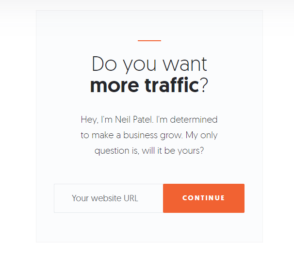
Above is an example of a simple form I use on my blog. All the user needs to do is enter their website’s URL and the action is complete. It doesn’t get much simpler than that.
Here are a few ways to ensure your forms are easy to fill out:
- Make form names clear.
- Use proper HTML formatting.
- Use relevant sample placeholder text (I used “Your website URL” in the example above).
- Have a distinct and easy-to-local submission button.
- limit your forms to the basics: name, email address, etc
Tip 4: Improve Your CTAs
If you want to improve conversions, CTAs are low-hanging fruit. The average CTA click-through rate is just 4.23 percent, but many factors can impact what helps your CTA convert.
For example, if you include more personalization in your CTAs, conversion rates can improve by up to 202 percent, according to Hubspot.
That’s why you should continually test CTAs to see what works and what needs improvement. You’d be surprised at how quickly user preference can change!
Start by testing these CTA elements:
- Copy
- Colors
- Placement
- Button shape
- Button size
- Page placement
Consider testing different types of CTAs as well, like:
- Buttons
- Text CTAs
- Form submissions
When it comes to branding, consistency is key. However, using colors outside of your branding palette for CTAs is worth trying. Colors within your palette might blend in too well with the rest of your site, making them easy for website visitors to overlook.
Tip 5: Run User Testing
Poor usability can kill your business. The stats don’t lie.
88 percent of shoppers wouldn’t visit a website again after seeing poor UX. However, despite that, too many companies are missing out on the financial benefits of UX optimization.
The State Of UX 2022 report from UserZoom shows companies don’t make the link between excellent UX design and revenue. Additionally, the report shows how too many organizations depend on incomplete metrics and don’t get actionable insights from their data.
I can guarantee that’s not great for your conversion rate optimization! There is a fix, though.
User testing gives you valuable data that can help you get more conversions across your website; it’s important to get this process started as quickly as possible.
One of the most common ways to run UX testing is with heat maps, which show how users navigate your site and what interactive elements they’re clicking on.
With heat maps, you can see if they’re looking at your links, navigation bar tabs, CTAs, and so on. Some heat maps even incorporate eye-tracking software to show where your users look first.

There are several heat mapping tools on the market, but my favorites are Crazy Egg and Hotjar. If you decide to use Hotjar, the process for setting them up is very simple and straightforward.
Tip 6: Add More Social Proof
More consumers than ever read social proof. In fact, 77 percent of users say they always or regularly read online reviews before buying.
You want to leverage customer loyalty as often as you can. Why? It’s free marketing and brand exposure.
Social proof is a simple and great way to leverage user-generated content for your brand. This can include positive reviews and ratings, creative social media posts about your brand shared by customers and influencers, user-submitted content like photography, and more.
The benefit of adding more social proof to your website is it shows other users that other people trust you. Trust and credibility play a big factor in getting more conversions.
To add more social proof, try:
- Sending a follow-up email asking for reviews.
- Hosting a contest with a branded hashtag on social media.
- Including a card with a branded hashtag when shipping physical products.
If you want to do it on a larger scale, consider automated tools like HotFomo and OptinMonster.
Tip 7: Use Chatbots or Live Chat
If you have a question, wouldn’t you rather get the answer fast? That’s the idea behind chatbots. No matter how great your customer service is, sometimes call queues are too long and customers get frustrated.
The good news? Users like chatbots, and they can have a significant impact on your conversion optimization rate. Research from Leadoo shows that conversions can increase between 10-100 percent, depending on what sector you’re in.
These tools help your brand build an instant connection with customers, making them more likely to purchase your product or service. Here are a few ways to leverage chatbots:
- Answer FAQs
- Qualify leads
- Suggest related products
- Troubleshoot common issues
- Share information about new products
- Increase your email list
With so many chatbot options available, it can be challenging to find the right one. I recommend focusing on native channel integrations to narrow your search.
If you want an app with widespread integration options, consider Landbot, which offers chat features through web, WhatsApp, Facebook Messenger, and API.
Perhaps you just need to integrate with Facebook Messenger? In that case, Chatfuel is an affordable solution.
Make sure that whatever chatbot you choose aligns with your business goals.
Tip 8: Review Customer Persona and Adjust Your Messaging
A customer persona is a fictional snapshot of your ideal customer. Personas are commonly used by marketing agencies and businesses to give their target audience a human face. They can help drive leads, increase conversions, and shorten the sales cycle.
According to MarTech, creating a persona can increase email CTR by 14 percent—and conversion rates by 10 percent.
The gap between who you think your ideal customer is and your actual customers may be more significant than you think.
For example, if your personas are businesswomen in their early 30s but your customer base is primarily homemakers in their 50s, there’s going to be a massive disconnect in how you approach your target audience.
Here are six steps you can take to make sure you are targeting the right customer personas:
- Make a list of your highest-value customers.
- Use a customer persona template to create a new persona.
- Start adding details from your highest-value customers. Start with demographics like location, age, budget, education, etc.
- What channels do your highest-value customers use to find you? Add that to your persona as “methods of communication.”
- Look at the content they consume—what does that tell you about their motivations? Add those to your template.
- Repeat the process for every product or service you offer.
It’s important to realign your customer personas with your messaging, sometimes as frequently as every two or three months. In some cases, this could mean tailoring your brand approach altogether to connect with the new target audiences working.
Tip 9: Use Targeted Lead Magnets
Lead magnets are a free resource (like an Ebook or guide) given away in exchange for user data. The most common lead magnets are PDFs or videos, but there are plenty of media types to use.
The best part? They work.
According to GetResponse.com, 47 percent of marketers said text and video lead magnets worked the best. However, if you’re looking at lead magnets from a conversion rate optimization perspective, video marketing and written content attracted the most conversions.
Just one more stat before I move on.
iIn regard to length, short-form lead magnets perform the best, with 73 percent of marketers saying this has the highest conversion rate.
Here are some more conversion rate optimization tips:
- The more targeted your lead magnets, the more effective they are likely to be. The key is to get creative with your targeting.
- You could even consider creating some more interactive lead magnets like quizzes or online calculators. According to a recent report, the average quiz has a lead capture rate of 40.1 percent.
- The way you target your magnet should depend on your product or service. For example, if you serve a geographical area, it may make sense to target leads based on location. Other websites might target leads based on industry or how they got to the site.
Here are a few other targeting options:
- Time on page
- Type of content
- Whether they’ve purchased before
- Industry
- Customer persona
- Location
- Time period (for example, a pop-up for an upcoming event)
Not sure how to add targeting to your lead magnet strategy? These lead magnet tools can help.
Whatever type of lead magnet you decide to create, be sure it aligns closely with your intended customer. Since the goal of lead magnets is to collect user data, you want to make sure the offer is valuable to your intended audience as well as your business.
Tip 10: Use Pop-Ups Carefully
Pop-ups have an average conversion rate of 11.09 percent, which makes them ripe for content rate optimization.
I have a love/hate relationship with pop-ups because they walk such a fine line between being beneficial (for you and your customer) and incredibly annoying. However, when done right, pop-ups can be an invaluable conversion tool.
In fact, Marketing 112 increased its conversion rates by 62 percent by adding a pop-up to its website.
First and foremost, your pop-ups should respect universal UX rules. These include fast load times, visible exit options (like the example from Wishpond below), and platform-appropriate size.
There should also be limits as to how often users see the pop-up. For example, a user who bypasses the pop-up once shouldn’t be bombarded with it on each page of your site they navigate. Note that not every type of pop-up, or interstitial, is created equal, especially on mobile. Google announced that because certain interstitials can hurt the mobile experience, they will be penalized if not implemented properly.
So check, double-check, and triple-check those pop-ups to make sure they are effective for you while also not hindering the user experience or getting dinged by Google.

When it comes to conversions, keep the messaging short with minimal effort to take the desired action.
You can also implement A/B testing to see how users interact with different versions of the pop-up. This is important for conversion rate optimization across the board.
Tip 11: Check Your Site Speed
I talk about site speed a lot, and with good reason. No one likes to be kept waiting, and that’s certainly true for internet users.
If your site loads slowly, all of the conversion rate optimization tips in the world won’t make a difference. In fact, website conversion rates drop by 4.2 percent for each additional second your site takes to load.
Even more surprising? More than 80 percent of sites don’t meet acceptable speeds.
Fortunately, there are plenty of free sites and tools that let you test your site speed and troubleshoot common issues.
PageSpeed Insights and Pingdom are two of the industry leaders in this domain. These tools have been around for years and offer the most in-depth testing and troubleshooting. They first look at contentful paint, time to interactive, and total blocking time to calculate your overall score.
What are some of the most common issues that slow down site speed?
- Render-blocking JavaScript
- Poorly-optimized CSS
- Large media files
- Bulky code
While some of these may require a database engineer or developer to resolve, you can usually start to tackle some issues (like large media files) on your own.
Tip 12: Follow up on Abandoned Carts
According to the Baymard Institute, the average cart abandonment rate is 69.99 percent. That rate is even higher on mobile, where the average shopping cart abandonment rate is 85.65%. However, rates vary considerably depending on what sector you’re in.
Recovering just a fraction of those missed sales could do wonders for your conversion rate.
If the main benefit of conversion rate optimization is converting consumers already on your site, then abandoned cart users are the cream of the crop. They actively started the transaction but didn’t complete the purchase.
There may be some obvious reasons for this, such as a discount code no longer being valid or high shipping rates. Whatever the reason, you should always aim to recover the lost sales using (almost) any means necessary.
In fact, if e-commerce sites just fixed checkout usability issues in their process, they could increase conversion rates by 35.26 percent, according to the Baynard Institute. This translates into more than $200 billion in recovered sales from the e-commerce industry alone.
Here are some other ways you can recover abandoned carts:
- Automated email flows
- On-site push notifications
- Retargeting ads
- Use personalization
- Automated social outreach
- Add a call to action
You shouldn’t harass potential customers who have abandoned carts, but you do want them to feel appreciated. You might want to follow up in a few hours, like some brands do. Alternatively, you may want to play with your outreach timelines to find the right approach for your customer base.
Tip 13: Make Sure Landing Pages Match Your Messaging
The average landing page converts just 2.35 percent of the time across all industries. If you want to be a top performer in your sector, you should be aiming for conversion rates above 10 percent.
How do you increase your landing page conversion rate?
One way is to ensure the messaging on your landing page matches the ad or copy that brought your prospect there in the first place. This creates a more cohesive experience, showing users that your page is the right fit for what they want. It also helps improve your PPC quality score.
Here’s how to match your messaging:
- Use similar language in your landing page and ad (especially the main keywords)
- Keep branding consistent (include your logo and use brand colors)
- Use a clear CTA on both your ad and landing page
Just imagine how off-putting two distinct messaging styles can be to the user. Imagine if you agreed to a job interview for a tech company and found out it was a restaurant when you arrived. It would feel like a bait-and-switch, right?
While a difference in messaging between an ad and landing page isn’t quite as off-putting, it’s close. The differences can be jarring and steer users away.
When creating your landing pages and ad copy, make sure you have a clear focus in mind. This would start with your keyword research when you select the target phrase for the page. You can include some secondary keywords on the landing page as well if you plan to use them in your ad copy.
Tip 15: Come Up with Your Customer Value Proposition
Customer value proposition, or CVP for short, clearly describes the added value that you bring to your customers and that no one else can give them.
It’s much more important to answer the question “Why should I buy from you?” as opposed to “What do I get, if I buy from you?”
A powerful and carefully crafted CVP moves you right to the bottom section of the customer conversation funnel.
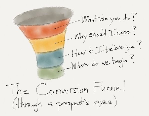
(Image source: Search Engine Land)
What you do should be utterly clear, the second someone lands on your page.
Your CVP can then take it a step further and help the customer find out if they share your why, your values, and whether or they can trust you.
Let’s look at some examples.
Chili’s has designed a great landing page, using Unbounce, with a clear CVP:

Kids eat free. Parents feel cool.
As a parent, I immediately understand why I should buy from them. I get to feel like a great parent.
My kids eat for free, which is something that no one else offers to me.
I immediately know that they sell pizza, because of the picture. The next step, how I can believe them, is right at the bottom.
A coupon for a free kid’s meal.
Okay, they’re putting their money where their mouth is. I like it.
This small business sells lemonade. They also have a good CVP.
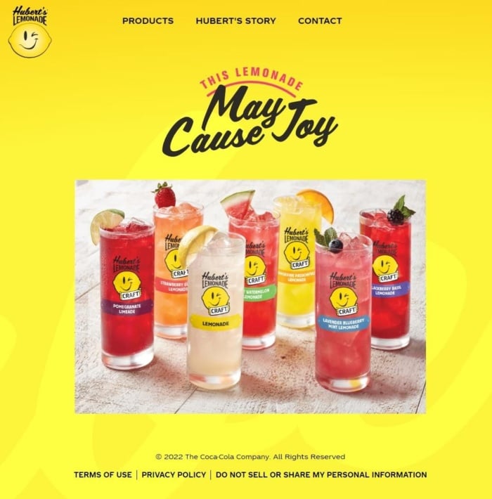
There are lemons on the glasses and, in the top left corner, the first thing that I see is a logo design with a lemon, so I instantly know that this company sells lemonade (plus it’s also part of the URL).
The CVP is a bold, 3 word sentence on the left, where my focus is drawn first.
May Cause Joy.
I drink the lemonade, it makes me happy.
I get that.
By the way, the better your CVP, the more consistent across products it is.
Uber is a great example.
This is what their landing page looks like, for people trying to get a ride:
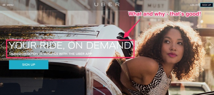
It instantly tells me what I’ll get (a ride), why I should use them (it’s on demand, so I control it) and what makes it super valuable (it’s very fast).
However, what if I want to drive, not just get rides?

Same thing. I get to use my car, work on my schedule, and it’s my choice.
They give me total control of the experience and my time, the same thing I get when ordering one to get a ride.
Your CVP can be a simple one-liner, or include all of the following pieces:
- Headline
- Subtitle
- Bullet points
- Image
- Social proof
It’s a brilliant and easy way to increase your conversion rate. Optimizing it doesn’t cost anything (except some A/B testing software, maybe), but has a big effect.
Tip 16: Use Colloquial Language
Let’s say there’s an employee, John, working at a security camera manufacturing company. It’s his job to write the item descriptions. John gets to work and here’s what he comes up with.

Doesn’t that make you want to bang your head against the wall? This is an actual description a company used for security cameras (that has been changed since, thankfully).
Somehow, as soon as we sit down to write, we instantly go into “must sound smart” mode.
Instead of keeping it simple, just like when we’re talking to a friend, we rack our brains to find the most complex terms and descriptions, so we sound sophisticated.
That’s dumb, and it doesn’t work.
Who buys those cameras? Average people!
Lorex, a competitor, does a better job of explaining its smart cameras.
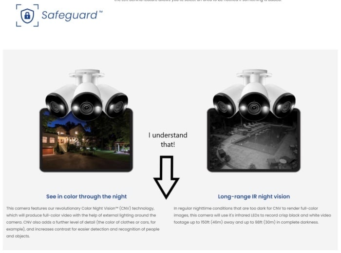
Just what I want to know, plus I can learn more, if I choose to.
Keep it simple, folks.
Don’t try to sound smart. Try to sound human.
Even better, don’t try at all.
In the end, there’s always a human being at the other end of the screen, so talk to them, instead of writing for an imaginary crowd.
Tip 17: Create a Sense of Urgency To Make Your Customers Take Action
Remember the “only a few left!” message on Walmart’s site?
That is urgency.
Telling your customers that they have a limited time to act helps them make a purchasing decision.
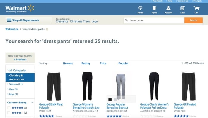
In Walmart’s case, you’re confronted with a huge choice, even if you’re just trying to buy dress pants. There are hundreds of options.
The paradox of choice suggests that if we face too many options, we often choose none.
To limit paralysis by analysis, you can make the decision easier; Hotels do this constantly.
Booking.com are the masters of this. Look at how they narrow down the choices with subheadings like ‘top picks’, ‘lowest price’, and ‘best reviewed.’
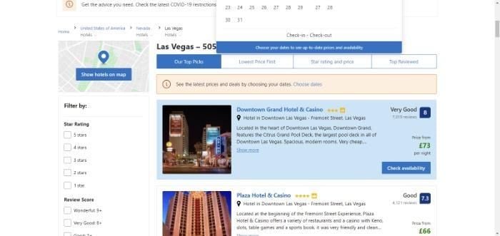
Then, at the top of the list, they have the ‘choose dates’, to spur the visitor into action.
Once past the initial call to action, Booking.com then has a further CTA button marked ‘show prices.’ When the visitor sees the price, there’s yet another CTA ‘check availability.’
From there, you get taken to further images and reviews, along with a discount offer if you sign in.
Everything about Booking.com combines to create a sense of urgency. Just look at the CTAs and you feel compelled to take the next step
Tip 18: Wipe Out All Concerns Up Front
You know that buying clothes and shoes is a fine art. Not only do they need to look stylish or comfortable, they’ve got to fit well.
For the salesperson at a clothing store, the goal is to make you feel more secure about your purchase and eliminate your concerns.
A good salesperson makes sure that whatever you buy is a perfect fit by measuring you, and if necessary, tailoring the item to your needs.
This doesn’t just happen in stores, though.
You have to be a good salesperson online, as well!
Online, you can’t advise your customer live and in-person (in most cases, but how about live chat?), but you can still address their concerns.
A good way to do so is a frequently asked questions section (FAQ). Most people who sell online courses do it:
Another is to show customer testimonials.
Start out by making a list of common objections. Put yourself in your customer’s shoes.
What counterarguments could you have against buying?
A few very common issues:
- You don’t understand my problem well enough.
- You understand my problem, but I don’t believe you can solve it.
- You understand my problem and I believe that your product works, but my situation is special and I’m not sure if it’ll work for me.
- You understand my problem, I believe your product works, even though my case is special, but you’re more expensive than the next best alternative.
How do you address those?
- Be very specific, when explaining what problem your product actually solves.
- Show references, ratings, awards you’ve won, certifications, and social proof.
- Show case studies and testimonials from various industries and applications of your product.
- Draw a comparison with your competitors (before they do), and show why your product is well worth the money (remember the CVP).
Make sure that your product perfectly serves your customer’s needs and then convince them of it by being a good salesman, taking them by the hand, and eliminating their objections.
Tip 19. Add Conversion Opportunities to Popular Blogs
Not every blog you post sets the world alight. However, when you do have a blog post that’s gaining major traction, make the most of it. If you’ve got tons of traffic flocking to a specific blog, it makes sense to add conversion opportunities.
I’m talking about things like including:
- CTAs
- Forms
- Lead magnets like eBooks and checklists
- Pop-ups
In addition, if you want to go for the sale straight away, you could offer discounts/products related to the products in your blog.
The key here is understanding your audience and what they’re most likely to respond to.
Tip 20. Use Retargeting
If you’re not familiar with retargeting, It gives marketers the opportunity to continue to reach out to customers who’ve shown an interest in one of their products.
Have you ever felt like an ad is following you around? For instance, you look at a mattress online. You don’t buy the first time, but when you go to, say, a news site, there’s an advert for the same mattress. That’s retargeting right there.
By following up with these potential customers, businesses can improve their chances of closing more sales and achieving more conversions.
When done correctly, retargeting not only increases sales but also helps to build relationships between the business and its customers. Retargeting allows for personalized messages that are tailored to each customer’s needs and interests; this creates a sense of trust between the business and its audience.
FAQs
Conclusion
When you consider the fact that customer acquisition is more than half of the battle, it makes sense to focus heavily on conversion rate optimization.
After all, converting more of your existing website traffic could drastically reduce customer acquisition costs.
You’ll notice most website conversion rate optimization tips focus on improving the user experience and enhancing the customer journey. That’s because they tend to have the most significant impact. However, you don’t have to implement all of these conversion rate optimization techniques immediately. Think about which will have the most significant impact and test those first.
Which of the conversion rate optimization tips above do you think will have the most impact on your conversion rate?